Linking census tract-level income data to electoral outcomes with ineAtlas
Pablo Garcia Guzman
2026-04-24
Source:vignettes/ineAtlas-income-voting.Rmd
ineAtlas-income-voting.RmdIntroduction
This vignette demonstrates how to combine data from the Spanish Statistical Office’s Atlas (accessed through ineAtlas) with other administrative data sources. We’ll analyze the relationship between income levels and voting patterns in Madrid’s census tracts using data from the 2021 regional elections.
Getting the data
We’ll combine two data sources:
- Income data at the census tract level
- Electoral results from Madrid’s 2021 regional elections
First, let’s get the election data:
# Electoral data
elections_raw <- data.table::fread(
    "https://datos.comunidad.madrid/catalogo/dataset/08aac4de-ca28-4f9c-b45d-ef8457c4b5d2/resource/5e8cf4ad-b9f4-4ffd-a026-c27433e7815f/download/datos_electorales_elecciones_autonomicas_comunidad_de_madrid_2021.csv",
    sep = ";",
    encoding = "Latin-1"
) %>% as_tibble()
Now, let’s get income data for Madrid’s census tracts using
ineAtlas:
Data processing
We need to process the election data and merge it with our income data:
# Process election data to census tract level
elections_proc <- elections_raw %>%
    select(PP, `P.S.O.E.`, distrito, seccion, cod_muni, votos_electores) %>%
    rename(
        pp = PP,
        psoe = `P.S.O.E.`,
        total_votes = votos_electores
    ) %>%
    mutate(
        cod_muni = str_pad(as.character(cod_muni), width = 3, pad = "0"),
        distrito = str_pad(as.character(distrito), width = 2, pad = "0"),
        seccion = str_pad(as.character(seccion), width = 3, pad = "0"),
        tract_code = paste0("28", cod_muni, distrito, seccion),
        share_pp = pp / total_votes,
        share_psoe = psoe / total_votes,
        tract_code = as.character(tract_code)
    )

# Merge and prepare for plotting
plot_data <- elections_proc %>%
    left_join(
        income_data,
        by = "tract_code"
    ) %>%
    mutate(income_percentile = percent_rank(net_income_pc)) %>%
    select(income_percentile, share_pp, share_psoe, total_votes) %>%
    pivot_longer(
        cols = c(share_pp, share_psoe),
        names_to = "party",
        values_to = "vote_share"
    )
Visualization
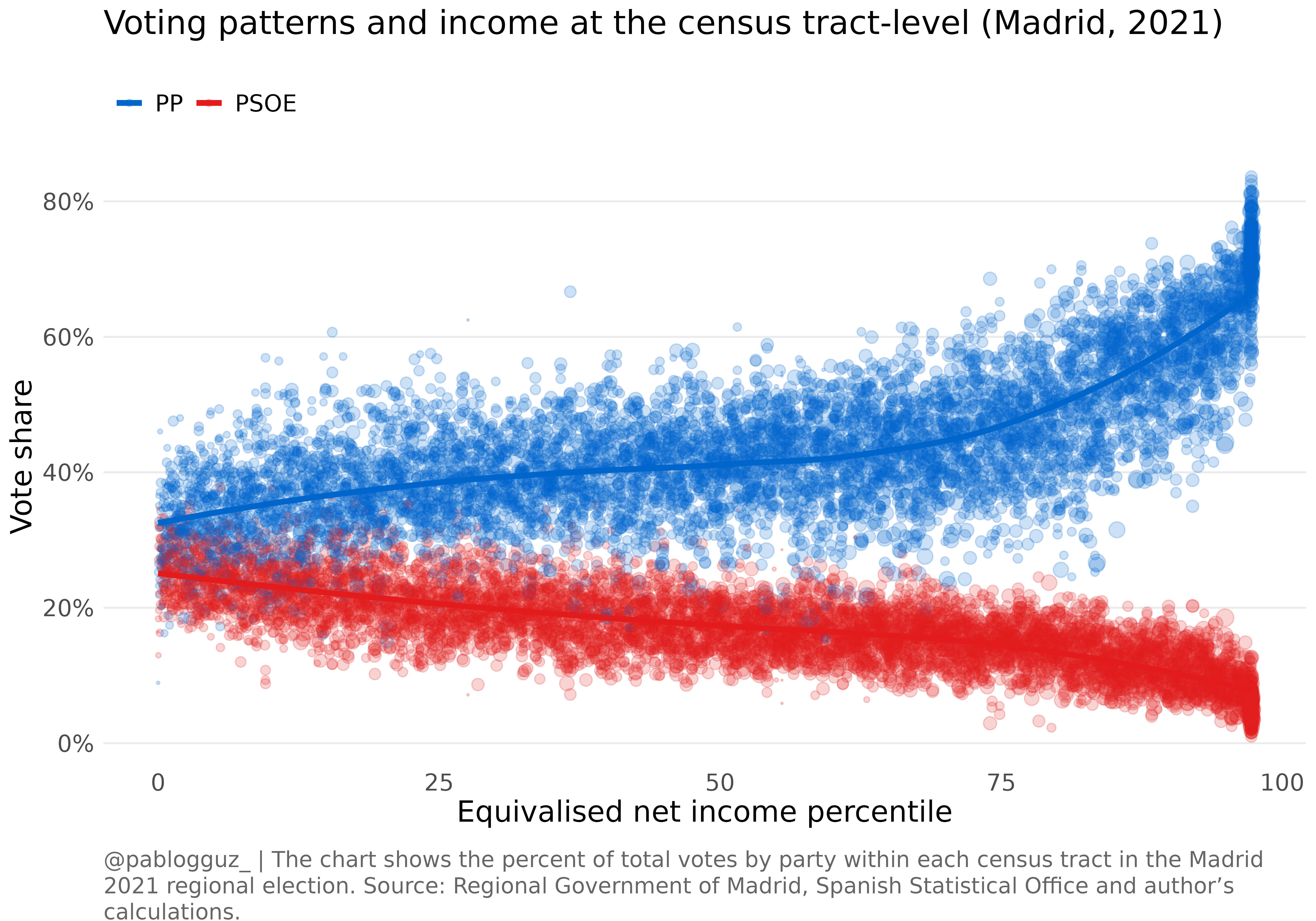
We’ll create a visualization showing how voting patterns vary with income levels across Madrid’s census tracts. In particular, we’ll focus on the vote share of the two main parties, the Popular Party (PP) and the Socialist Party (PSOE):
ggplot() +
    geom_point(data = plot_data,
               aes(x = income_percentile * 100,
                   y = vote_share * 100,
                   color = party),
               size = plot_data$total_votes/200,
               alpha = 0.2) +
    geom_smooth(data = plot_data,
                aes(x = income_percentile * 100,
                    y = vote_share * 100,
                    color = party),
                method = "loess",
                se = FALSE,
                linewidth = 1.5) +
    scale_color_manual(
        values = c("share_pp" = "#0066CC", "share_psoe" = "#E31C1C"),
        labels = c("share_pp" = "PP", "share_psoe" = "PSOE"),
        name = NULL
    ) +
    scale_y_continuous(labels = function(x) paste0(x, "%")) +
    labs(
        title = "Voting patterns and income at the census tract-level (Madrid, 2021)",
        x = "Equivalised net income percentile",
        y = "Vote share",
        caption = "@pablogguz_ | The chart shows the percent of total votes by party within each census tract in the Madrid 2021 regional election.
        Source: Regional Government of Madrid, Spanish Statistical Office and author's calculations."
    ) +
    theme_minimal() +
    theme(
        text = element_text(family = "Open Sans", size = 16),
        plot.title = element_text(size = 18, margin = margin(b = 20)),
        plot.caption = element_textbox_simple(
            size = 12,
            color = "grey40",
            margin = margin(t = 20),
            hjust = 0  # This left-justifies the caption
        ),
        legend.position = "top",
        legend.justification = "left",
        panel.grid.minor = element_blank(),
        panel.grid.major.x = element_blank()
    )